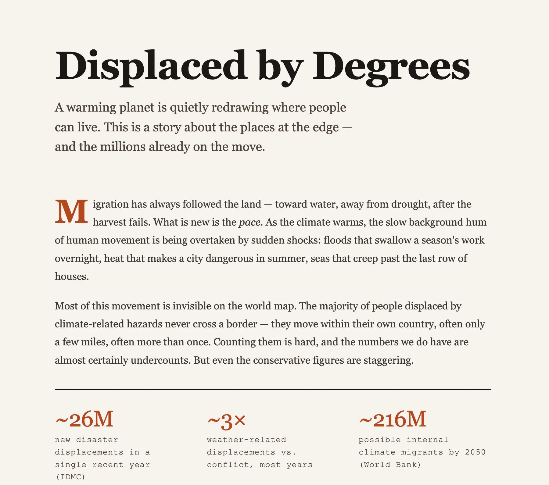
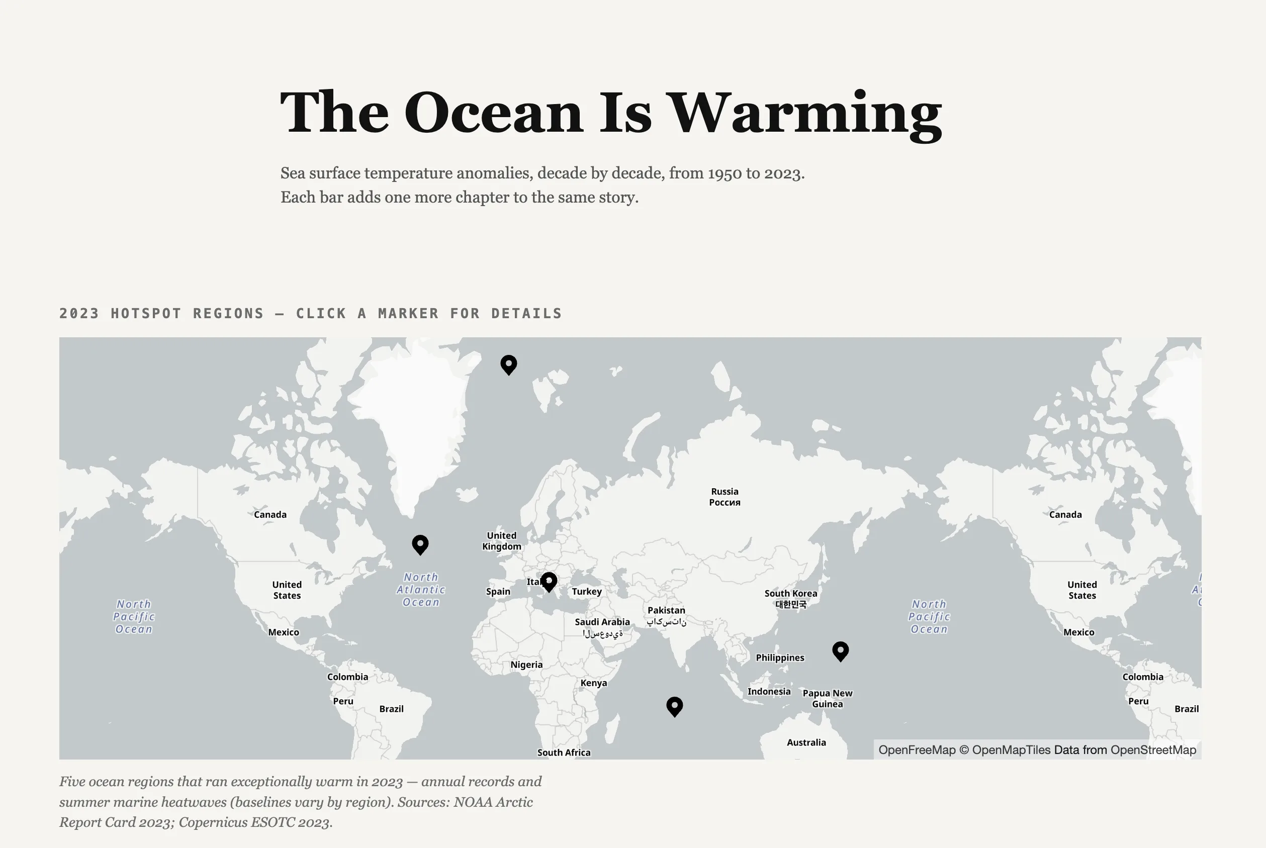
Data Story schema
The Data Story schema builds a scroll-driven data explainer from a single prompt. As the reader scrolls, the narrative advances one chart at a time — each step reveals or annotates a figure while the text explains what it means. Ideal for data journalism, reports, and turning a raw dataset into a story anyone can follow.
How to trigger it
Ask for a data story or data explainer in natural language, in any language:
- “Create a data story on global temperature anomalies since 1950”
- “Build a scroll-driven explainer of our 2024 sales by region”
- “Walk readers through these survey results, one chart at a time”
- “Racconta l’andamento demografico italiano con un grafico alla volta”
What you get
A self-contained HTML page where scroll drives the analysis. The data story includes:
- A framing opening — the question the data answers and why it matters
- Chart steps that build the argument one figure at a time — bar charts, line charts, pie charts, comparisons, and diagrams, each annotated as it enters view
- Map-based views when the data is geographic
- A closing that states the takeaway the numbers support
Tips for best results
- Bring your data. Paste a table, attach a file, or describe the figures — the AI will not invent numbers. It uses labelled placeholders until you supply real values.
- Lead with the takeaway. Tell the AI the conclusion the data supports; it sequences the charts to build toward it.
- One idea per step. Each scroll step should make a single point — the AI splits dense data across steps rather than crowding one chart.
- Pick the right chart. Mention whether a comparison, a trend, or a share-of-total matters most, or let the AI choose the chart type per step.
- Iterate freely. Ask to add a chart, change a chart type, or reorder steps — the AI updates the page in place.